Vinamilk: what it kept mattered more than what it changed

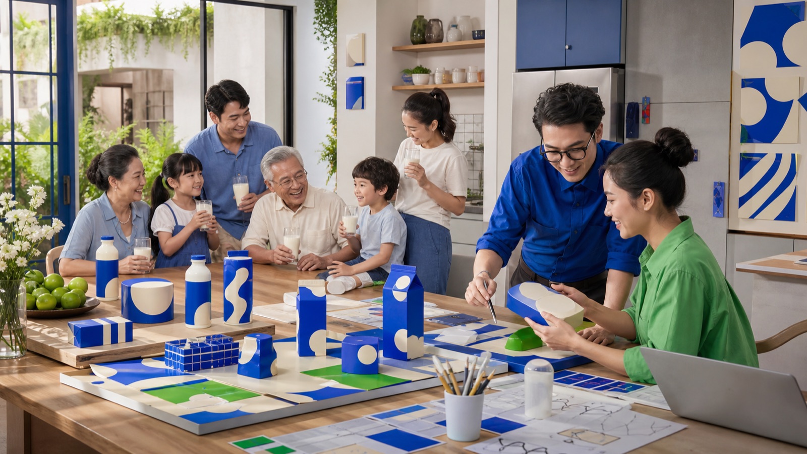
A Vietnamese family and design team inside a renewed blue brand world. Editorial illustration generated with AI.
After 47 years, Vinamilk replaced its entire identity for the first time. The smartest part was not what changed - it was what stayed.
In July 2023, Vinamilk ran its first comprehensive rebrand in 47 years: the logo moved from an emblem to a hand-drawn "Vinamilk" wordmark whose brushstroke forms a smile, in "vivid blue" and "sweet cream". A proprietary VNM typeface family was built (with Studio DUY and Yellow Type Foundry) and rolled out across every touchpoint. The lesson: modernize while keeping the core recognition assets - evolution, not erasure.
What exactly did Vinamilk do?
A new logo: from emblem to a handwritten "Vinamilk" signature whose brushstroke forms a smile - friendly and confident. Color: the signature blue spirit stayed ("vivid blue") paired with a "sweet cream" tone - familiar yet new. A proprietary typeface: the VNM family (Display, Standard, Text) built with Studio DUY and Yellow Type Foundry, guaranteeing long-term consistency. Synchronized touchpoints: packaging, website, stores and publications - one unified identity system, not just a logo swap.
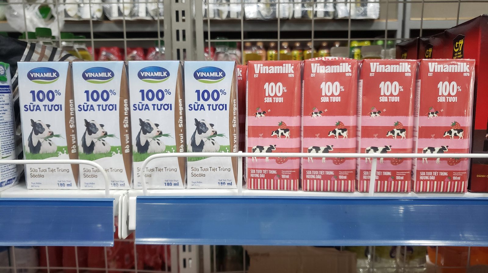
Vinamilk cartons on a store shelf. Photo: Pdhadam, Wikimedia Commons, CC BY-SA 4.0.
Why did it work where others failed?
Vinamilk modernized without throwing away brand memory. The blue and the friendly feeling - what Vietnamese consumers had known for decades - remained, so customers still recognized the brand instantly. Meanwhile the handwritten signature, youthful language and proprietary typeface made the brand more confident and ready for international markets. That is the crucial difference from the famous failures - New Coke's taste U-turn, Tropicana's packaging collapse, Gap's six-day logo - where brands changed so much that customers no longer recognized what they loved.
A glass of milk, a product tied to the brand. Stock photo (CC0).
What can your business borrow?
Rebrand as evolution, not erasure. Keep the core recognition assets - color, emotional symbol, the familiar feeling - while refreshing the form; the same discipline behind Highlands' one-color refresh. Invest in the system, not just the mark: a proprietary typeface and a standards document keep every touchpoint consistent for years - exactly what a brand guideline exists to do, at any budget. And notice the sequencing: Vinamilk rebuilt its identity as a platform for going international - form following strategy, never the reverse.
To compare Vinamilk with nine other Vietnamese brands, read 10 Vietnamese brands worth studying in 2026 - each profile covers the identity system, the business evidence and where the brand goes next.
Case study compiled from Vinamilk's public rebrand launch (July 2023) and design-industry coverage of the identity system. Details reflect the launch period.
Frequently asked questions
When did Vinamilk rebrand?
In July 2023 - the first comprehensive identity change in the company's 47-year history. The logo moved from an emblem to a hand-drawn 'Vinamilk' wordmark whose brushstroke forms a smile, in two colors: a vivid blue and a sweet-cream tone.
What did Vinamilk keep and what did it change?
It kept the signature blue and the friendly feeling Vietnamese consumers had known for decades - so recognition survived. It changed the form: emblem to handwritten wordmark, a youthful visual language, and a proprietary VNM typeface family (Display, Standard, Text) built with Studio DUY and Yellow Type Foundry, rolled out consistently across packaging, website, stores and publications.
Why is Vinamilk's rebrand considered a success?
Because it modernized without discarding brand memory - the opposite of famous failures like Tropicana's 2009 packaging change or Gap's 2010 logo, where brands changed so much customers no longer recognized them. Vinamilk's evolution-not-erasure approach, backed by a full identity system rather than just a new logo, made the change feel confident rather than confusing.