Highlands Coffee: one color, same bean, 700 stores

A brand team reviewing packaging and the experience of a Vietnamese coffee chain. Editorial illustration generated with AI.
After 23 years, Highlands Coffee removed colors to make its logo lighter, tighter - and more owned by its customers. The 2022 refresh is a masterclass in changing without erasing.
In November 2022, after 23 years, Highlands Coffee refreshed its logo with the message "It Belongs To Us". It kept the familiar two coffee-bean curves (hills - river - plains stylized inside) but simplified from red-brown-yellow to a single red on transparent background. At the time, Highlands ran 700+ stores - Vietnam's largest chain. The lessons: simplify identity for the digital age, keep the core recognition shape, and anchor the rebrand in a human message.
What exactly did Highlands change?
Simplified color: from a red-brown-yellow palette to a single red on a transparent background - rendering cleanly on every surface and screen. Kept the coffee-bean mark: the two signature curves stayed, with Vietnam's hills, rivers and plains stylized inside. A community message: "It Belongs To Us" built around four values - Passion, Love, Respect, Sharing. Repositioning: leaning into community and Vietnamese identity as the brand's raw material.
Repositioning must be tested across stores, packaging and menus, not only the logo. Illustration generated with AI.
Why is this refresh worth studying?
A flat, single-color, transparent-background logo is a thoroughly digital-age choice: it works on an app icon, a paper cup, a storefront sign and a social avatar without breaking. More importantly, Highlands kept the coffee-bean shape - a recognition asset burned into memory - so even with the color change, customers recognize it instantly. And the rebrand was anchored to a human message rather than being a purely aesthetic swap. The difficulty was scale: founded in 1999, Highlands was Vietnam's largest coffee chain with more than 700 stores at refresh time - syncing hundreds of signs, packages and uniforms while stores kept selling every day. The competitive backdrop made it urgent: the wave of Katinat and Phê La - three positioning strategies we analyzed in the Vietnamese drink-chains case study - was pulling younger customers with fresher experiences.
What can your business borrow?
One, digital-first identity: logos in this decade should be flat, single-color and scalable - simplify until they display consistently on app, packaging, signage and social. Two, keep the core shape: the recognition asset customers already know is capital, not baggage - modernize around it, the same discipline that made Vinamilk's rebrand work and whose absence sank Jaguar's Copy Nothing gamble. Three, anchor the rebrand in a human message, not just new aesthetics - "It Belongs To Us" gave staff and customers a reason to care. For the document that keeps all this consistent, see brand guidelines for SMEs.
Case study compiled from Highlands Coffee's public rebrand announcements (November 2022) and Vietnamese business press coverage. Store counts reflect the refresh period and change over time.
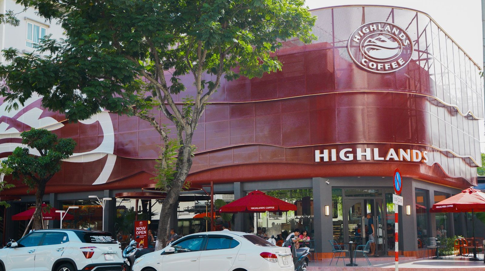
A dedicated visual selected for this article. A dedicated editorial visual selected for this article.
Frequently asked questions
When did Highlands Coffee change its logo?
In November 2022, after 23 years in business, alongside the message 'Highlands Coffee - It Belongs To Us' ('La Cua Chung Minh'). At the time of the refresh, Highlands operated more than 700 stores nationwide - Vietnam's largest coffee chain by store count.
What changed in the new Highlands logo?
The two coffee-bean curves - with stylized hills, river and plains inside - were kept, but the palette was simplified from three colors (red, brown, yellow) to a single red on a transparent background. Flat, single-color and scalable, it renders cleanly on apps, paper cups, storefront signs and social media.
Why didn't Highlands change the name or start over?
Because the brand was still healthy: the Highlands name and its signature red were recognition assets built over 20+ years. A refinement-style rebrand refreshed the feeling for younger customers without erasing brand memory for loyal ones - and kept the cost of resyncing 700+ stores manageable.