Viettel: the identity followed the strategy, not the trend


Digital infrastructure connecting Vietnamese families, engineers and businesses. Editorial illustration generated with AI.
Viettel did not change color because red looked nicer. It changed because the entire direction of the company had changed - and the identity had to tell that truth.
On January 7, 2021, Viettel unveiled a new identity: dropping the yellow-blue palette of 16 years for red, with the slogan \u201cYour Way\u201d and a new core value, Aspiration. The second rebrand since 2004, it embodied the strategic shift from telecom operator to digital services company under the 2018 mission of pioneering the digital society. Context of scale: Brand Finance ranks Viettel Southeast Asia's most valuable telecom brand at around 9 billion USD. The lesson: identity should follow strategy - not aesthetics.
What exactly did Viettel change?
The lead color: dropping 16 years of yellow-blue for red - youthful, aspirational, energetic. A new slogan: "Your Way", emphasizing personalization and diversity. A new value: "Aspiration" joined the existing two (Care, Creativity). Strategy-first: the change embodied the 2018 mission of "pioneering the creation of a digital society" - the move from telecom operator to digital technology company.
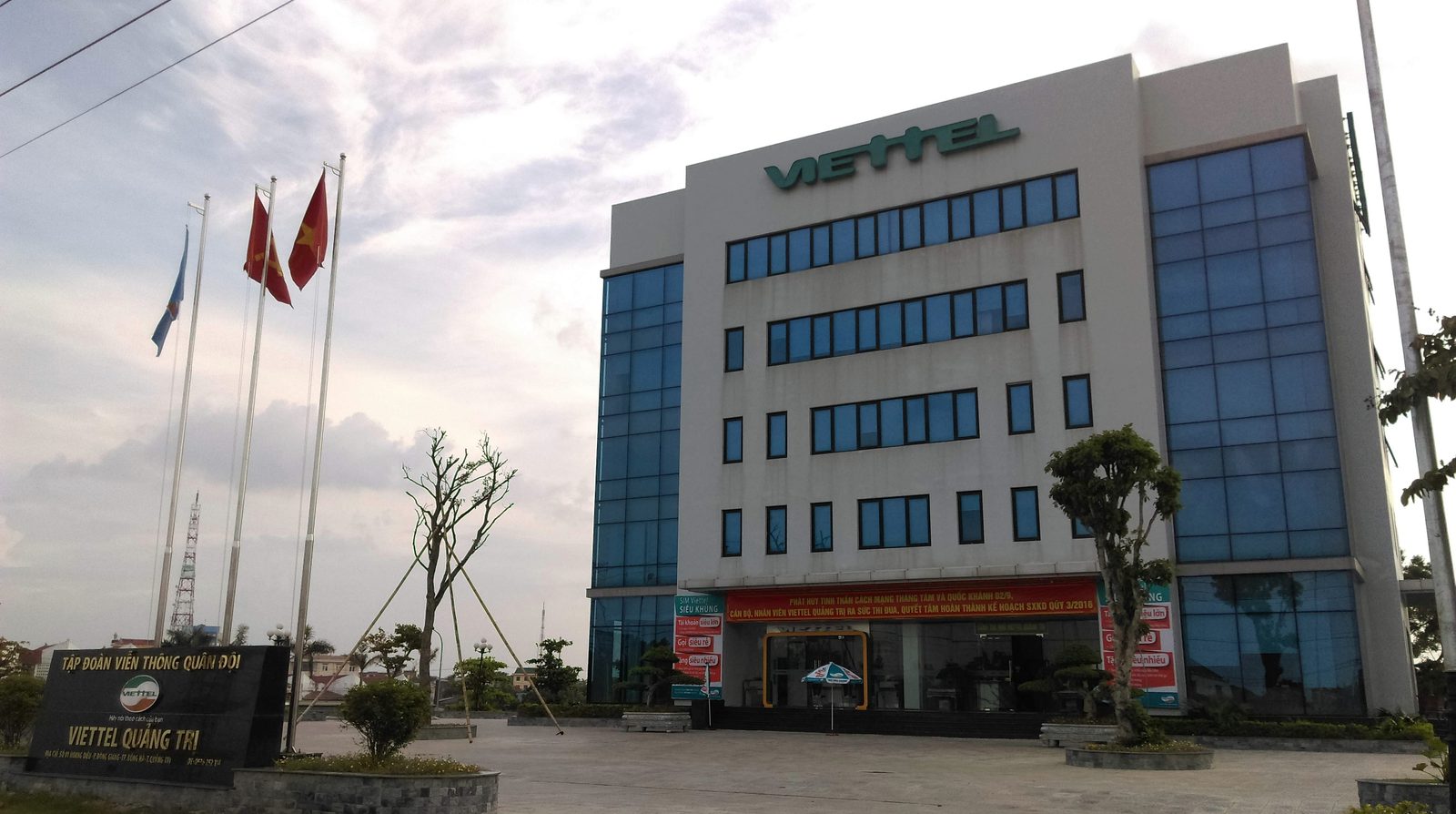
A Viettel building with its branding. Photo: Linhcandng (thảo luận), Wikimedia Commons, CC BY-SA 2.0.
Why is this rebrand worth studying?
Because it is a rebrand that followed strategy rather than aesthetics. When Viettel shifted from carrier to digital-technology company, the new identity was the signal sent to the market about that direction. But swapping a color after 16 years is a genuine gamble: you trade accumulated recognition capital for a new image - a trade only worth making when a real strategic shift stands behind it. The scale underscores the stakes: Brand Finance has repeatedly ranked Viettel Southeast Asia's most valuable telecom brand at around 9 billion USD, and the 2021 identity was the opening shot of the digital-ecosystem strategy, not a one-off facelift.

A user making a call on a mobile phone. Stock photo (CC0).
What can your business borrow?
Identity follows strategy - never the reverse. Change your identity radically only when the business direction has genuinely changed; then the rebrand is a meaningful signal. Changing a logo or color merely because it "feels old" is a gamble that spends brand capital without a strong enough reason - the failure mode of Jaguar's Copy Nothing. Compare the two Vietnamese paths: Vinamilk and Highlands evolved within their equity because their strategy was continuity; Viettel broke its palette because its strategy broke first. Both are correct - because in both cases, the identity told the truth about the business.
Viettel is one of ten profiles in our free field guide, 10 Vietnamese brands worth studying in 2026, with a condensed identity system, current business figures and the next move for each brand.
Case study compiled from Viettel's public rebrand launch (January 2021) and Brand Finance rankings. Figures reflect reporting at the time.
Frequently asked questions
When and why did Viettel rebrand?
On January 7, 2021, Viettel unveiled a new identity: dropping the yellow-blue palette of 16 years for red, with the slogan 'Theo cach cua ban' (Your Way) and a new core value, 'Khat khao' (Aspiration). It was the second rebrand since 2004, and it followed strategy: Viettel was shifting from a telecom operator to a digital services company under its 2018 mission of 'pioneering the digital society'.
Why is changing a 16-year-old color scheme considered a gamble?
Because accumulated recognition is capital: every year customers see the same colors, the brand equity compounds. Swapping it trades that stored capital for a new image - a trade worth making only when a genuine strategic shift stands behind it. Viettel's did: the new identity was the market signal of a real change in direction, not a cosmetic refresh.
How big is the Viettel brand?
Brand Finance has repeatedly ranked Viettel as Southeast Asia's most valuable telecom brand, with a brand value around 9 billion USD - far ahead of regional peers. The 2021 rebrand was the opening shot of its digital-provider strategy rather than a stand-alone facelift.