The Gap logo: a rebrand undone in six days


A design team debating familiar brand equity and a minimalist redesign. Editorial illustration generated with AI.
In 2010, American fashion brand Gap replaced its legendary logo with a new design. About six days later, they brought the old logo back. It remains one of the world's most instructive rebranding lessons.
Gap abruptly replaced the logo it had worn for over two decades with a design widely judged generic - no story, no strategic reason, no testing. Customers and designers revolted on social media, and Gap restored the old logo after roughly six days. The lessons: never swap a strong brand asset just for newness, and always test customer reaction first.
What did Gap actually do?
The old Gap logo - the word in the blue box - had been a familiar icon for more than 20 years. In 2010, with sales flattening, Gap wanted a more modern image and unveiled a completely different design: a common font with a small blue square, released almost without warning, with no explanatory campaign and no brand story. The design was widely judged generic - and, more fatally, it replaced a symbol burned into customer memory without a convincing reason.
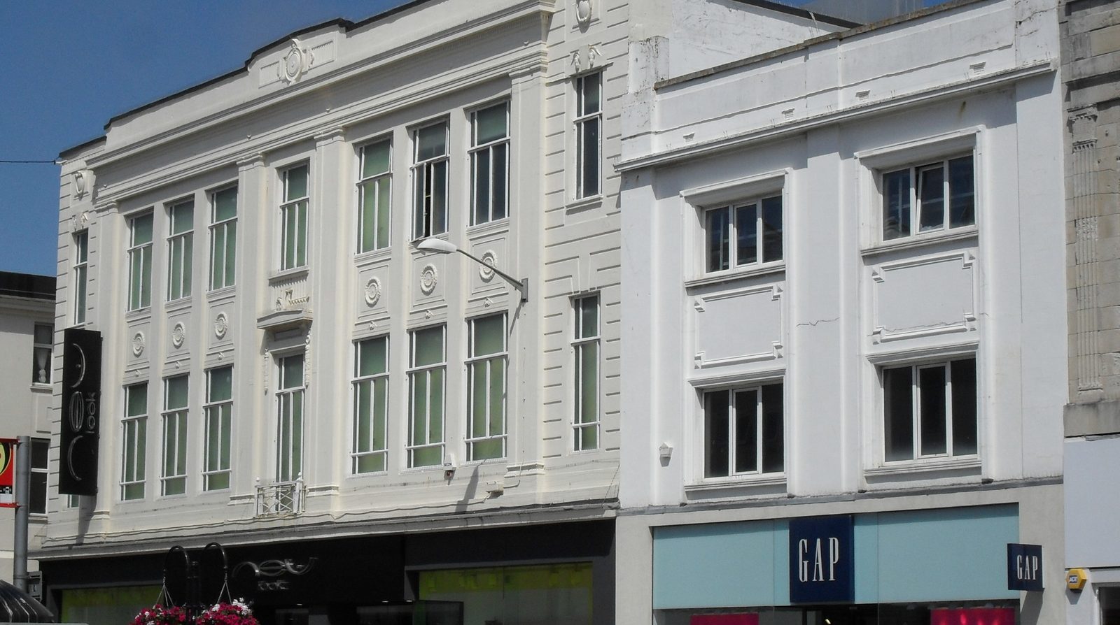
A Gap store with its brand sign. Stock photo (CC0).
How fast did it collapse?
The negative reaction detonated instantly across social media and the design community: parody accounts, mock logos and critical essays appeared within days. Under the pressure, Gap announced the return of the old logo after roughly six days - turning the project into a rebranding failure still cited today. The speed is the lesson: in the social-media era, an identity misstep is judged in hours, not quarters.

Rows of clothing hangers in a store. Stock photo (CC0).

A vintage-styled shop interior. Stock photo (CC0).
Why exactly did it fail - and what is the antidote?
Changed for newness, not strategy: no reason strong enough to replace a beloved symbol - the exact opposite of Viettel, which broke its palette because the business strategy genuinely broke first. No story: launched bare, leaving customers to guess. No testing: zero reaction checks before going public. Underestimated ownership: after 20 years, customers feel an identity belongs to them. The antidote is the discipline shown by Vinamilk and Highlands: evolve within your recognition assets, anchor the change in a message people understand, and test before you leap - the same pattern that separates every winner from every loser in our rebrand series, including the New Coke U-turn that preceded them all.
Case study based on widely reported events of October 2010; the Gap logo belongs to Gap Inc. and is discussed here for commentary and education.
Frequently asked questions
What happened with the Gap logo in 2010?
In October 2010, Gap abruptly replaced the logo it had used for more than two decades - the word in the blue box - with a new design using a generic font and a small square. The backlash from customers and the design community was immediate and ferocious, and Gap restored the old logo after roughly six days. It remains one of the most-cited rebranding failures in the world.
Why did the Gap rebrand fail?
Four compounding mistakes: changing for newness rather than strategy - there was no compelling reason to replace a beloved symbol; launching with no story, so customers could not understand why; skipping testing entirely, with no customer-reaction check before going public; and underestimating how much ownership customers feel over an identity they have lived with for 20 years.
What should a business learn from Gap's six days?
Never trade a strong recognition asset just to feel current: an identity customers love is capital, and spending it requires a strategic reason they can understand. Test before you launch - a quiet reaction check costs little and would have caught this instantly. And if you must change, tell the story: an unexplained swap reads as arbitrary, and arbitrary invites revolt.