Shop feng shui: entrance, checkout counter, lighting

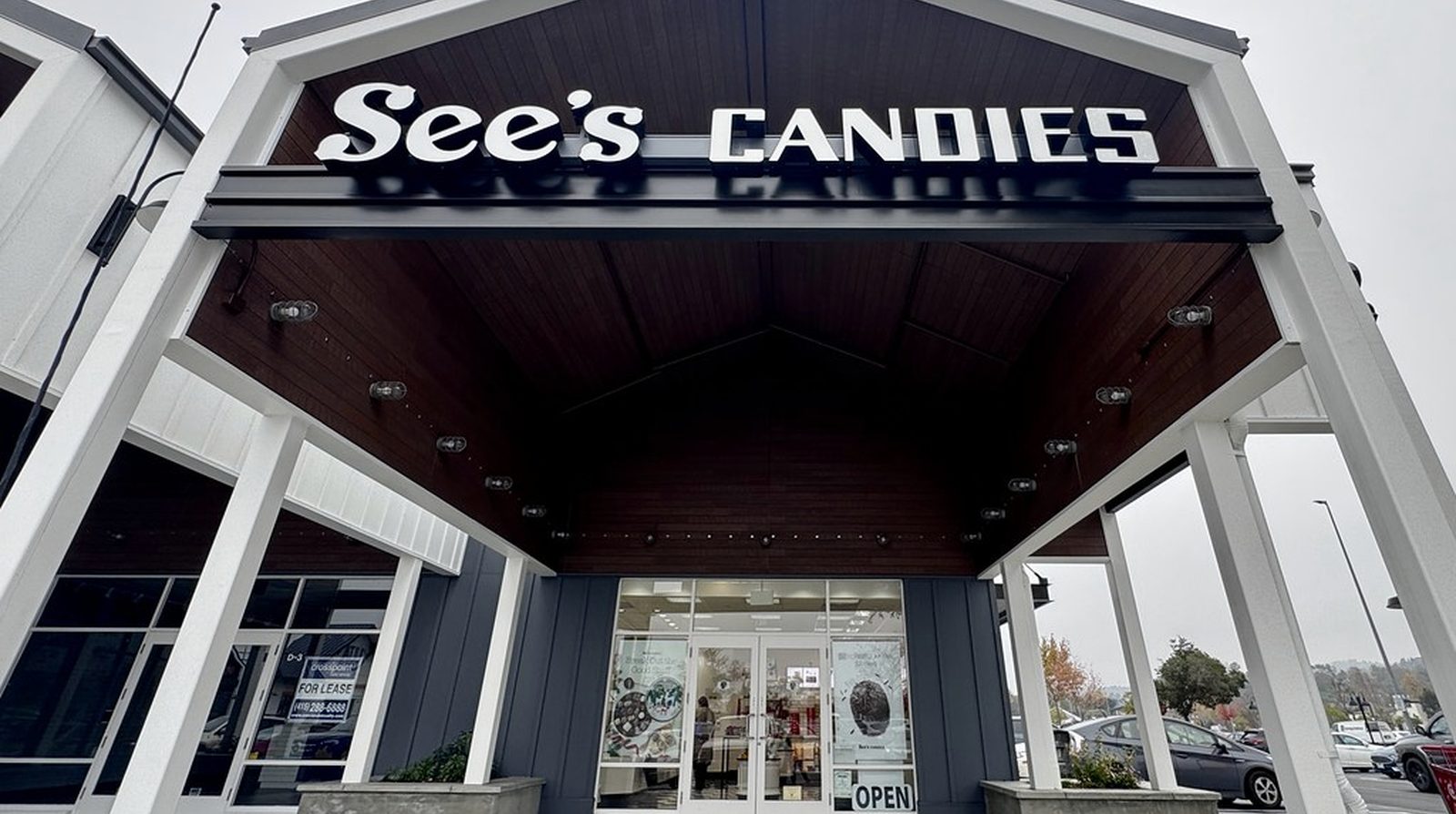
Illustration: the storefront and entrance, where most of the walk-in rate is decided.
Diagram: the four stages of customer circulation and the metric attached to each stage.
Shop feng shui is usually passed on as a list of things to avoid. We work the other way round: keep the principle, but always ask which physical or behavioural mechanism sits behind it, then check the answer against business numbers.
Quick summary: Read in modern terms, shop feng shui is a set of rules about an unobstructed entrance, a checkout counter that does not block the way, a route that pulls customers deeper into the room, and lighting and colour temperature suited to each zone. Every rule has a physical or psychological reason you can explain: sightlines, personal space, contrast, noise, temperature. After changing the layout, measure four things: walk-in rate, dwell time, depth of travel and average order value.
What is shop feng shui actually describing?
Most feng shui rules for shops revolve around three things: the flow of people coming in, the view from outside to inside, and how comfortable it feels once you are in. Those are exactly the three variables modern retail design chases. When a feng shui practitioner says the door must be open so energy can enter, the measurable part of that sentence is: pedestrians can see inside, nothing blocks the threshold, and stepping in requires no difficult decision. We keep the advice, drop the promise of fortune, and replace it with a testable question: after the change, how many passers-by actually walk in?
This approach does not diminish feng shui. It accepts that many principles handed down over centuries are the result of empirical observation about space and people, simply described in another language. Our job is to translate and to verify.
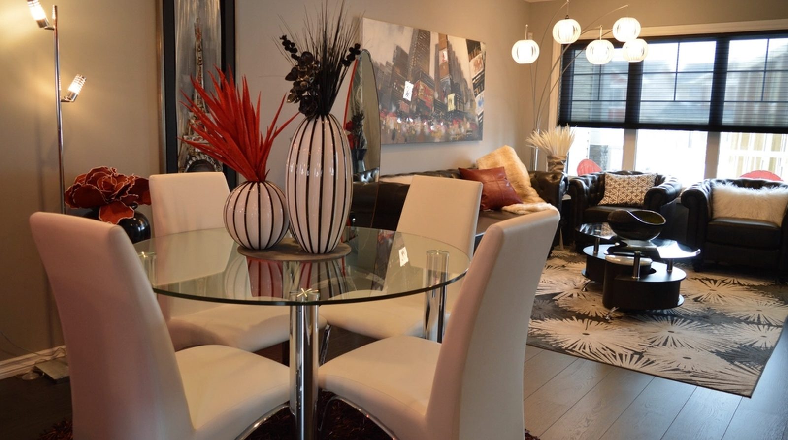
A harmonious layout shapes the feel and flow of movement inside a store. Stock photo (CC0).
How should the entrance be laid out?
The entrance decides most of the walk-in rate. The familiar feng shui principle is that the door should be wide, bright and free of obstruction. The physical reason is simple: someone walking on the pavement scans for one to two seconds, and they only turn in if they can see enough of the interior to guess what the shop sells. A standing sign, a large planter or a high step all interrupt both the sightline and the stride.
- Keep a clear sightline from the pavement at least 5 to 6 metres deep. Do not place shelving taller than 1.4 metres right behind the door.
- Keep the threshold flat. A step higher than 15 cm noticeably reduces older customers and anyone pushing a pram or trolley.
- Brighter than outside at night, never darker than outside by day. The eye resists stepping from a bright zone into a dark one.
- Let the door open along the natural direction of foot traffic on the pavement, removing one thing the customer has to think about.
Rules about doors facing doors, or a door opening straight onto a busy road, once you strip away the metaphysical layer, usually come down to draughts, dust, noise and a feeling of being exposed. All of those are measurable, and all of them shorten how long a customer stays.
Where does the checkout counter belong?
Traditional feng shui often advises placing the counter where it can watch the door without facing it directly. The behavioural part behind that advice is personal space. When a customer walks in and immediately meets a staff member at close range, the natural reflex is defensive, and many people will glance around and leave. Placing the counter off the first sightline, set further back, gives the customer a buffer in which to orient themselves.
Retail literature usually calls this buffer the transition zone, roughly 3 to 5 metres from the door. Merchandise displayed in that zone is almost ignored, because the customer's eyes are still adapting to the new light and layout. Putting the checkout counter or your hero products there wastes good floor area.
The counter position also shapes how far customers walk. A counter set deep forces people past at least one display before they pay, which creates the chance of an added item. This is why many supermarkets put their tills far from the entrance, and it has nothing to do with anything spiritual.
How do you draw customers deeper inside?
Customers tend to loop and leave early if they see no reason to keep going. The feng shui principle about winding paths and avoiding straight runs is in fact describing a visual mechanism: people walk towards whatever their eyes find worth looking at. An aisle that reveals everything from the doorway gives no reason to take another step.
- Place a visual anchor at the end of each stretch: an accent light, a block of colour, or a large product. Customers travel from anchor to anchor.
- Keep the main aisle at least 1.2 metres wide so two people can pass without brushing shoulders. Narrow aisles are a common reason customers leave, especially women.
- Put hero products on the right along the direction of travel, because most customers drift right out of traffic habit in Vietnam.
- Leave one resting point with something to lean on or sit on in the back half of the shop. A pause increases dwell time.
- Avoid dead ends. People are reluctant to walk into a space they must exit by the same path.
Digital touchpoints should follow the same route rather than sit wherever there is spare wall. Attaching scan codes to the right stage of the journey is covered in more detail in QR codes as in-store digital touchpoints, and the wider framing sits in retail space design in the AI era. If the idea of merging physical and digital layers is new to you, start with what phygital means.
How much do lighting and colour temperature matter?
Lighting is the feng shui factor easiest to explain with physics. The eye moves towards whatever is brighter than its surroundings, so contrast matters more than total wattage. A shop lit evenly everywhere leaves the eye with nowhere to land, while a shop with accents roughly 2 to 3 times brighter than the background guides attention to the hero products by itself.
On colour temperature, a common retail reference range is 2700K to 3000K for zones that need warmth and relaxation, such as fashion, furniture and cafes, and 4000K for zones where detail matters, such as fitting rooms, jewellery cases and the checkout. Above 5000K reads as cold and industrial, which suits a supermarket or an equipment store more than a space where you want people to linger.
Colour rendering deserves attention too. Lamps with a CRI below 80 make fabric and skin tones look wrong, which drives higher return rates in fashion and cosmetics. A CRI of 90 or above is the commonly recommended figure in retail lighting guidance.
Do plants and microclimate really matter?
Feng shui places plants in the balancing group of elements. The measurable part is microclimate and comfort. Indoor temperature is best held around 24 to 26 degrees Celsius with humidity between 50 and 65 percent, the band most people in Vietnam find comfortable in everyday clothing. Drift outside that band and customers cut their visit short quickly, and it shows up in the numbers before staff notice anything.
Real plants soften harsh sightlines, reduce echo in rooms full of hard surfaces, and give the route a soft visual anchor. A planter in the wrong place, right at the threshold or in the middle of the main aisle, does precisely the opposite. It is a clear example of the same object helping in one position and obstructing in another, with no luck involved.
Common layout mistakes
- A checkout counter blocking the door for easier supervision, at the cost of customers being watched the moment they enter and cutting their visit short.
- Displaying the most expensive items in the transition zone, the first 3 metres, where customers are not really looking yet.
- Cool white light above 5000K in a fashion store, which drains colour from fabric and makes the room feel unwelcoming.
- Music that is too loud, forcing customers and staff to raise their voices and ruining the advice-giving that is a physical shop's advantage.
- Aisles under 1 metre between two shelving units, causing people to avoid a row when someone else is already browsing it.
- A mirror facing the door, which beyond the traditional taboo also creates glare and makes customers hesitate at the threshold.
How do you measure the effect of a layout change?
Without measurement, every layout change is just an opinion. The four metrics below are enough for a small or mid-sized shop to track on its own, with no expensive system. Measure for two weeks before and two weeks after the change, at the same hours and the same weekdays, to avoid seasonal noise.
Walk-in rate
People entering divided by people passing by. Counting by hand for 30 minutes across three time slots gives a usable sample. This metric reacts fastest to changes at the entrance and storefront.
Depth of travel
What share of customers go past the halfway point of the shop. Mark a line on the floor and observe, or read it from cameras you already have.
Dwell time
Average time a customer stays. You can estimate it manually or pull it from wifi or camera data. This is the metric most sensitive to light, temperature and noise.
Average order value
Revenue divided by number of receipts. A better layout usually moves this number before it moves total revenue.
Change one variable at a time. Change the entrance, the lighting and the counter position together and you will never know which one produced the result.
If you want someone alongside you from site survey through layout and measurement, see the space and phygital service packages at Chạm AI, browse the projects we have built, or read the professional profile on the Đoàn Vi page.
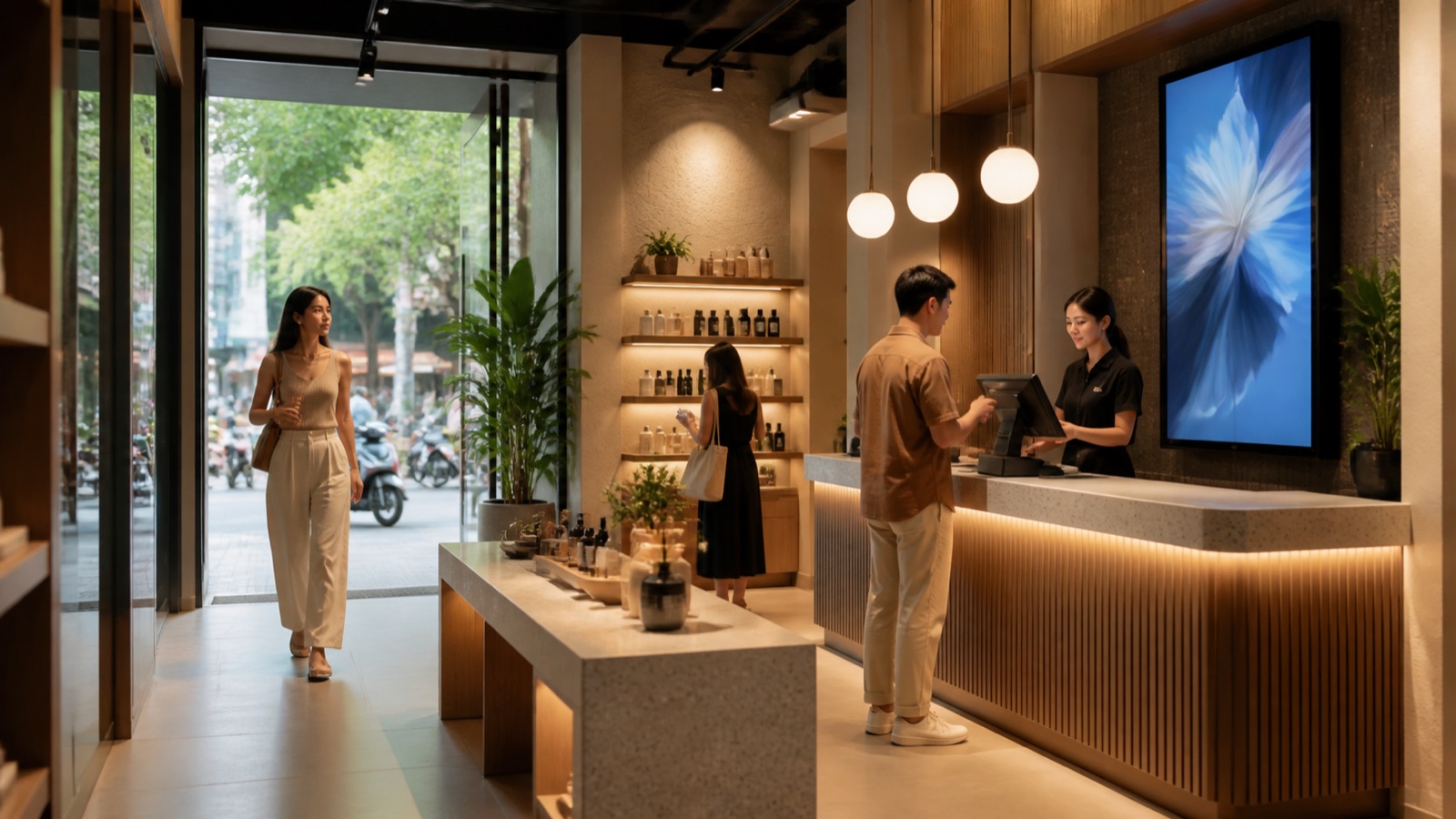
A dedicated visual selected for this article. Editorial illustration generated with AI.
FAQ - Frequently asked questions
Does shop feng shui bring good fortune to a business?
Our reading promises no luck. Most rules about entrances, circulation and lighting are describing physical and psychological conditions that make it easier for people to step inside and stay longer. Rearrange the shop around those conditions and results change because behaviour changes.
Where should the checkout counter go in a shop?
Usually off the first sightline from the door and set further back into the room. A counter blocking the entrance makes customers feel approached too early, so they shorten their visit. A counter set deep makes people walk past at least one display before paying.
What colour temperature should shop lighting use?
A common reference range is 2700K to 3000K for zones that should feel warm, and 4000K for zones where detail matters such as fitting rooms or the checkout. More important than the number is contrast: hero products should be brighter than their background.